Fonts, Flow & Feel
The Untold Role of
Typography in UX
Discover how the art and science of typography shapes digital experiences, influences emotions, and guides users through seamless journeys. From subtle psychological triggers to measurable business impact.
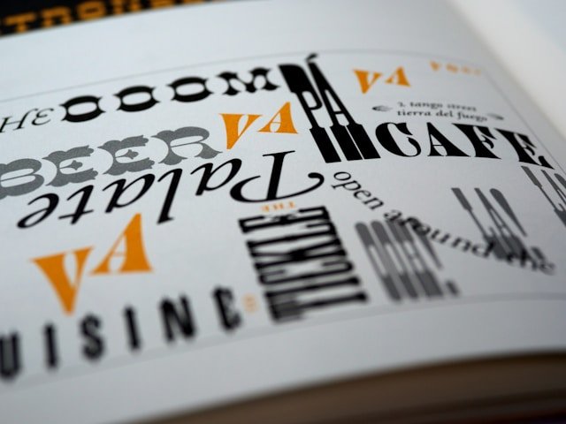
Why Typography Matters
Typography is more than just choosing pretty fonts. It is the silent workhorse of user experience, affecting readability, mood, and even the perceived credibility of your brand. Research shows that users form judgments about a website's credibility within 50 milliseconds, and typography plays a crucial role in this split-second decision.
In the digital age, where attention spans are shrinking and competition is fierce, typography becomes your silent salesperson. The right typeface can increase reading comprehension by up to 20%, while poor typography can drive away 38% of users from a website entirely.
Good typography can increase brand recognition by up to 80% and improve user engagement rates by 25-40% across digital platforms.
Key Typography Principles for UX
Master these principles to create interfaces that are not only beautiful, but also functional and accessible.
Readability & Legibility
Choose typefaces and sizes that are easy to read on all devices. Avoid overly decorative fonts for body text and ensure sufficient contrast with the background.
Hierarchy & Structure
Use font weights, sizes, and spacing to guide users through content. Clear hierarchy helps users scan and find information quickly.
Consistency
Stick to a limited set of fonts and styles. Consistency builds trust and makes your interface feel cohesive.
Emotion & Brand Voice
Typography sets the tone for your brand. Playful, serious, modern, or classic—your font choices should reflect your message and audience.
Common Typography Mistakes
Avoid these pitfalls to ensure your text enhances, not hinders, the user experience.
Too Many Fonts
Using more than 2-3 fonts creates visual clutter and confuses users.
Poor Contrast
Low contrast between text and background strains the eyes and reduces accessibility.
Tiny or Huge Text
Text that is too small or too large disrupts reading flow and can alienate users.
Ignoring Line Spacing
Cramped lines make text hard to read, while too much space breaks continuity.
Typography Checklist for Designers
A practical checklist to ensure your typography enhances rather than hinders user experience.
Visual Hierarchy
Readability
Responsiveness
Performance
Pro Tip: Test your typography with real users and content. What looks perfect in design mockups might need adjustment when implemented with actual text and user interactions.
The Psychology Behind Fonts
Understand how different typefaces trigger emotional responses and influence user behavior at a subconscious level.
Emotional Impact
Serif Fonts
Convey tradition, reliability, and authority. Perfect for financial services, legal firms, and academic institutions.
Sans-serif Fonts
Project modernity, cleanliness, and efficiency. Ideal for tech companies, startups, and contemporary brands.
Script Fonts
Evoke elegance, creativity, and personalization. Great for luxury brands, weddings, and artistic ventures.
Cognitive Response
Reading Speed
Sans-serif fonts can increase reading speed by 10-15% on digital screens, while serif fonts perform better in print.
Memory Retention
Slightly harder-to-read fonts can actually improve memory retention by forcing deeper cognitive processing.
Trust Factor
Consistent typography increases perceived trustworthiness by 42% according to UX research studies.
Typography for Accessibility
Design inclusive experiences that work for everyone, including users with visual impairments, dyslexia, and other reading challenges.
Visual Clarity
- • Minimum 16px font size for body text
- • 4.5:1 contrast ratio for normal text
- • 3:1 contrast ratio for large text
- • Avoid low-contrast color combinations
Dyslexia-Friendly
- • Use fonts like OpenDyslexic or Lexie
- • Avoid italics and ALL CAPS
- • Increase letter and word spacing
- • Left-align text, avoid justification
Mobile Optimization
- • Minimum 18px for mobile body text
- • Increase tap target sizes
- • Optimize for one-handed use
- • Consider thumb-friendly layouts
WCAG 2.1 Compliance Checklist
Typography in Action
See how thoughtful typography choices elevate real-world digital products across different industries and use cases.
E-commerce
- • Clear product titles and prices
- • Readable descriptions
- • Trust-building font choices
- • Scannable category navigation
SaaS Platforms
- • Hierarchical dashboards
- • Data clarity with mono fonts
- • Consistent UI labels
- • Status indicators and alerts
Mobile Apps
- • Large, tappable text
- • Responsive scaling
- • Brand personality in headlines
- • Thumb-friendly navigation
Advanced Typography Techniques
Master professional techniques that separate good typography from exceptional design.
Typographic Hierarchy
H1 - Primary Headlines
48-72px, bold weight, maximum impact
H2 - Section Headers
32-48px, semi-bold, clear section breaks
H3 - Subsections
24-32px, medium weight, content organization
Body Text - Content
16-18px, regular weight, optimal readability
Font Pairing Strategies
Contrast Pairing
Combine serif headers with sans-serif body text
Mood Matching
Choose fonts with similar emotional qualities
Weight Variation
Use different weights of the same font family
The Golden Ratio in Typography
The golden ratio (1.618) can create harmonious font size relationships that feel naturally balanced to the human eye.
The Future of Typography in UX
Variable fonts, AI-driven personalization, and accessibility-first design are shaping the next era of digital typography.
Variable Fonts
One font file, endless weights and styles—enabling faster load times and more creative flexibility.
AI-Powered Personalization
Machine learning will help tailor font size, contrast, and spacing to individual user needs and preferences, creating truly adaptive interfaces.
Accessibility-First Design
Future typography will prioritize inclusive design from the start, with built-in accessibility features and real-time adaptation for diverse user needs.
Context-Aware Typography
Smart typography that adapts based on device, lighting conditions, user activity, and even emotional state for optimal readability and experience.
Continue Your Typography Journey
Dive deeper into the art and science of typography with our comprehensive collection of UX-focused articles.
Kerned for Clarity
How Letter Spacing Impacts Cognitive Load
Deep dive into how subtle spacing adjustments improve scanability and comprehension in digital interfaces.
The UX of Numbers
Typography in Data-Heavy Dashboards
Explore how type choices affect readability in metrics, tables, financial apps, and real-time analytics.
The Invisible UX Crime
Font Fallbacks and Their Unexpected Impact
How neglected font fallback stacks break branding, layout, and readability — and how to fix them.
Font Loading Strategies
That Don't Ruin UX
FOIT, FOUT, and techniques to improve perceived performance without sacrificing design integrity.
Cultural Typography
Designing for Multilingual UX Interfaces
How typefaces perform across Latin, Devanagari, Arabic, Chinese scripts, and multilingual UI challenges.
Rhythm in Type
How Baseline Grid Affects UX Coherence
Baseline grids create visual rhythm, alignment, and harmony across UI components.
Designing With Dyslexia
Typography for Cognitive Accessibility
Font traits, spacing, and alignment best practices for dyslexic users and cognitive accessibility.
Are Custom Fonts Worth It?
UX Gains vs Performance Costs
Weighing user experience, brand uniqueness, page load impact, and fallback considerations.
Variable Fonts in UI Design
The Next Frontier in Typographic UX
How variable fonts work, where they shine in responsive UI, and their performance impact.
Emotional Typography
Fonts as Micro-Mood Modifiers in UX
How subtle shifts in font weight, roundness, or case can nudge emotion without user awareness.
Typography for Voice & AR/VR
Next-Generation Interface Design
Where traditional typography meets futuristic interfaces — spatial design, legibility, and motion.
Font Pairing Patterns
That Actually Improve UX
Beyond beauty: how font pairings enhance scannability, sectioning, and content flow.
Typography-Driven Prototyping
Letting Type Guide Design First
Starting prototypes with type scale and rhythm, not layout or imagery — a design methodology shift.
Master Typography for Better UX
Ready to transform your design approach? These deep-dive articles will equip you with advanced typography knowledge that goes beyond aesthetics to measurably improve user experience.
Conclusion
Typography is the invisible hand that guides users, sets the mood, and builds trust. Invest in your type, and you invest in your user experience.
In the digital landscape of 2025, typography has evolved from a simple aesthetic choice to a critical component of user experience strategy. The fonts you choose, the spacing you implement, and the hierarchy you create all work together to either enhance or hinder your user's journey.
As we've explored throughout this article, good typography goes beyond visual appeal—it's about accessibility, psychology, performance, and ultimately, creating meaningful connections between your brand and your users. Whether you're designing a mobile app, a website, or any digital interface, remember that every typographic decision impacts the user experience.
Start with your users' needs, embrace accessibility standards, and never underestimate the power of well-crafted typography to transform your digital products from functional to exceptional.
Ready to Transform Your Digital Typography?
Let our expert design team help you create typography that not only looks beautiful but also enhances user experience and drives business results.